54º40’ Beer
54º 40’ Beer is based in Washington State and specializes in easy-drinking German-influenced beers. They were looking to grow production and awareness in the local market but their current brand was lacking cohesion without an overall point of view, coupled with a bland and uninspired visual identity.
We stripped everything back to the blueprints and constructed an entirely new brand system, built on the framing of a singular belief…that beer is simply a tool for the larger purpose of human connection.
Scope
Naming
Visual Identity
Brand Strategy
Positioning
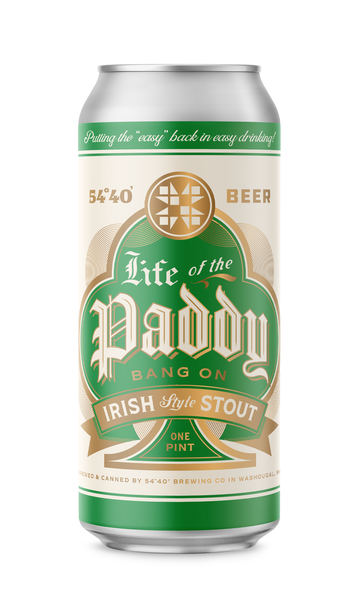
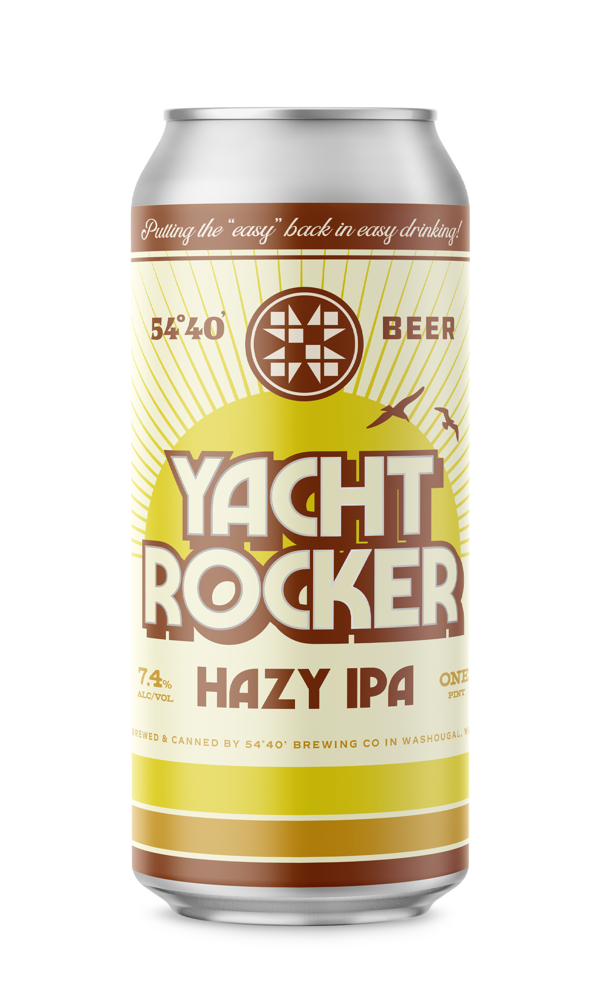
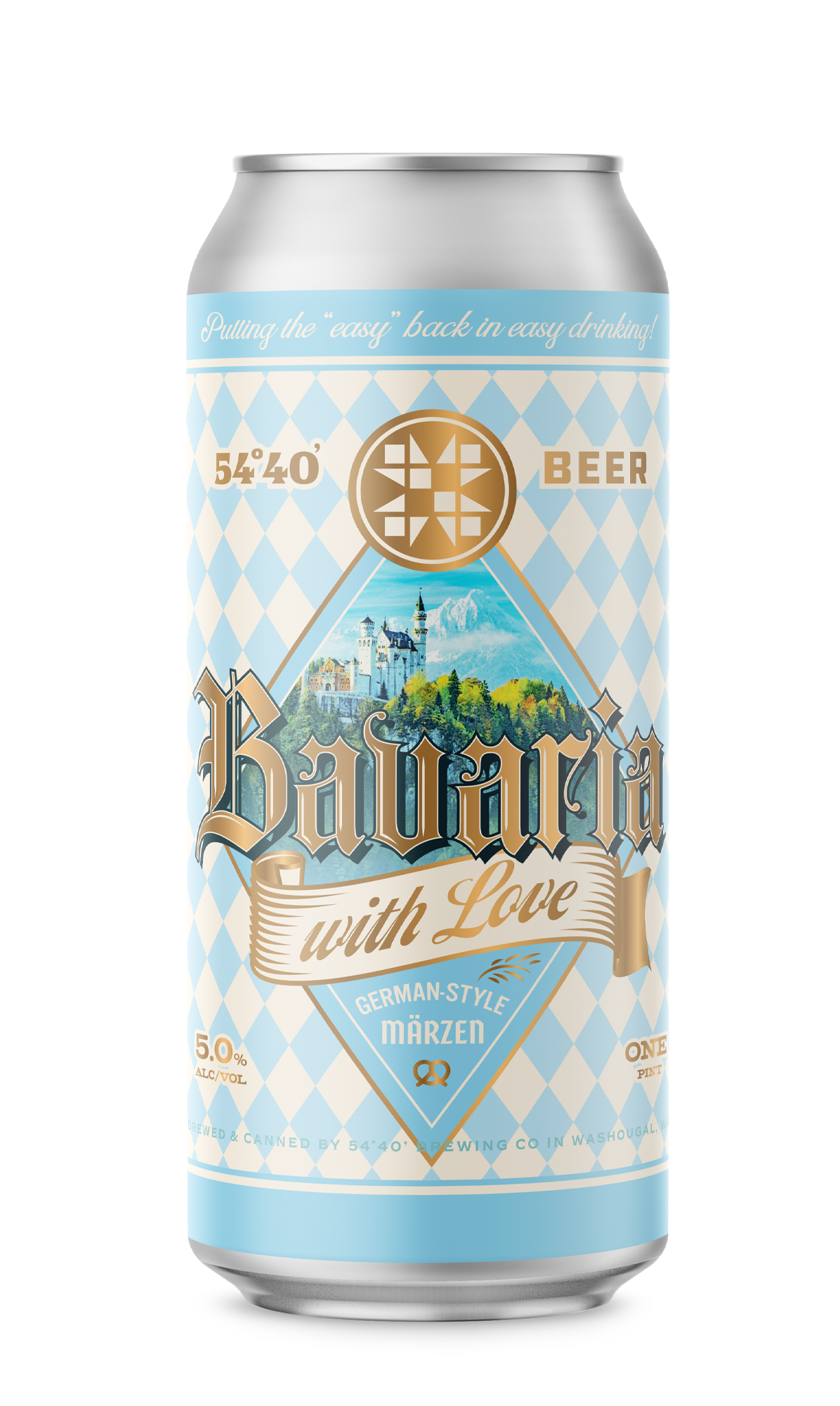
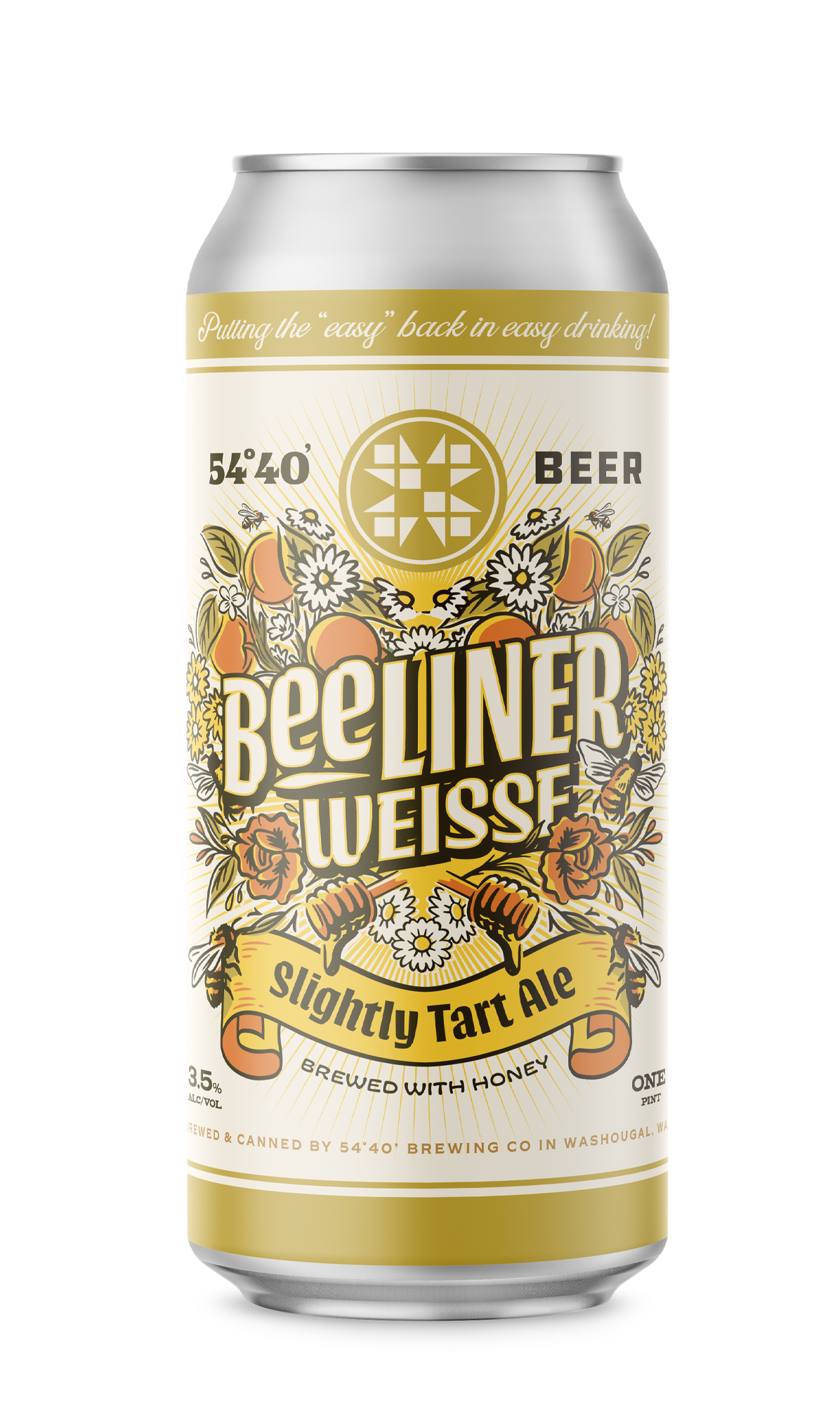
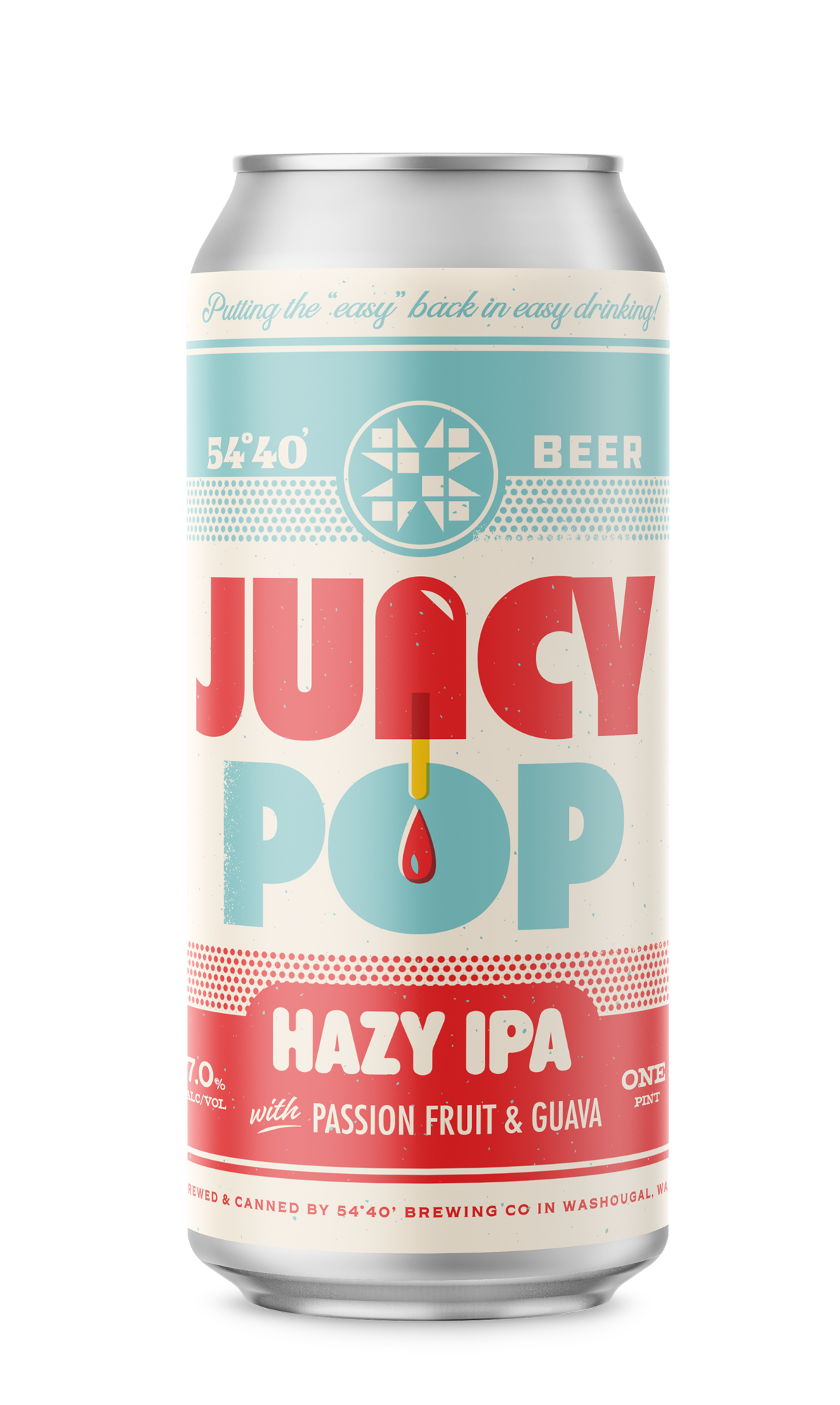
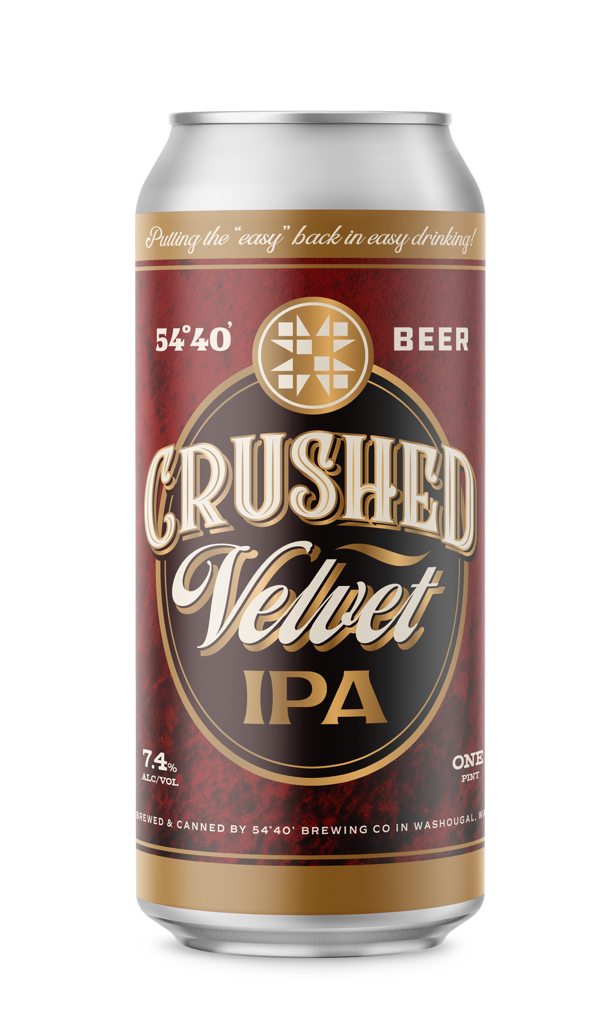
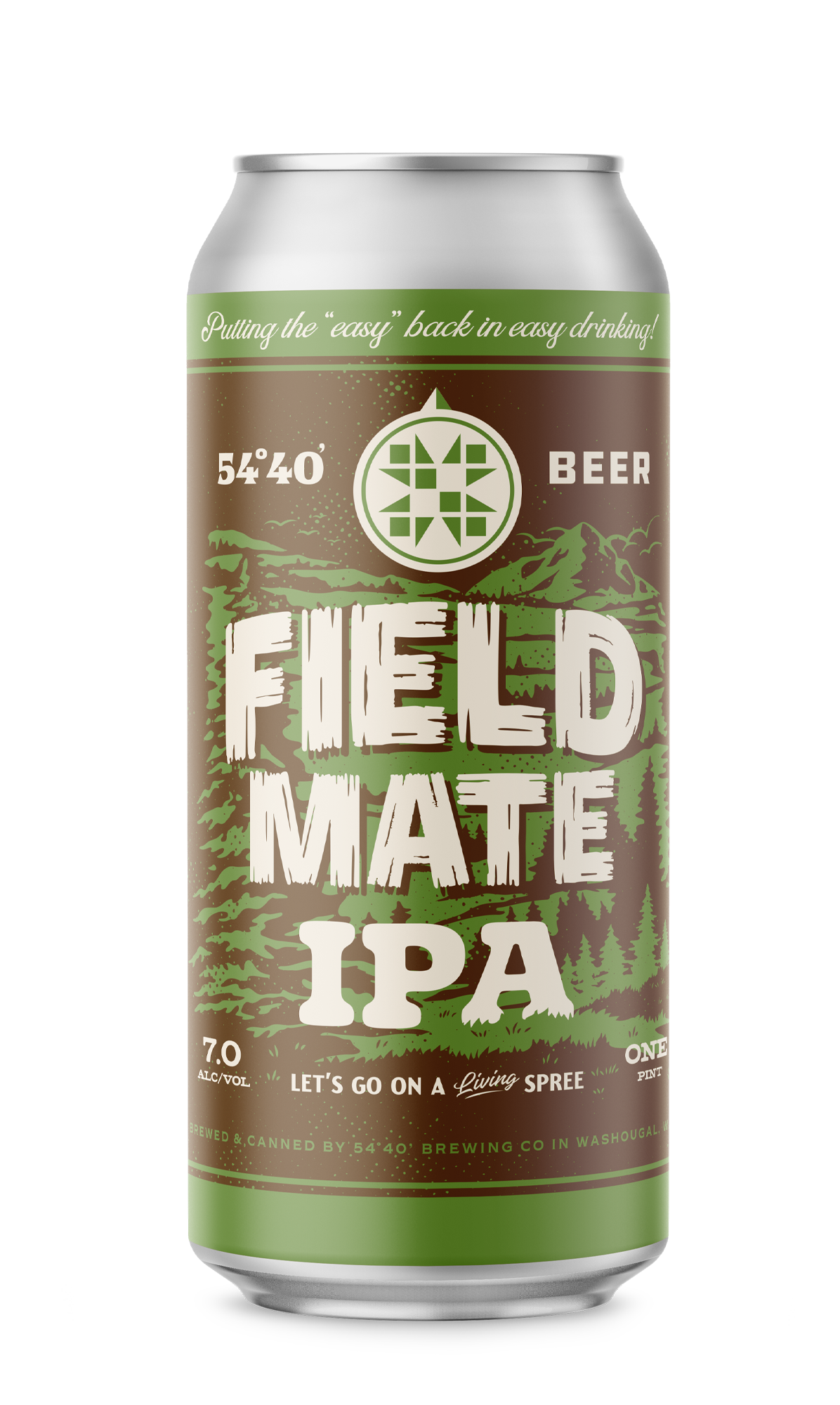
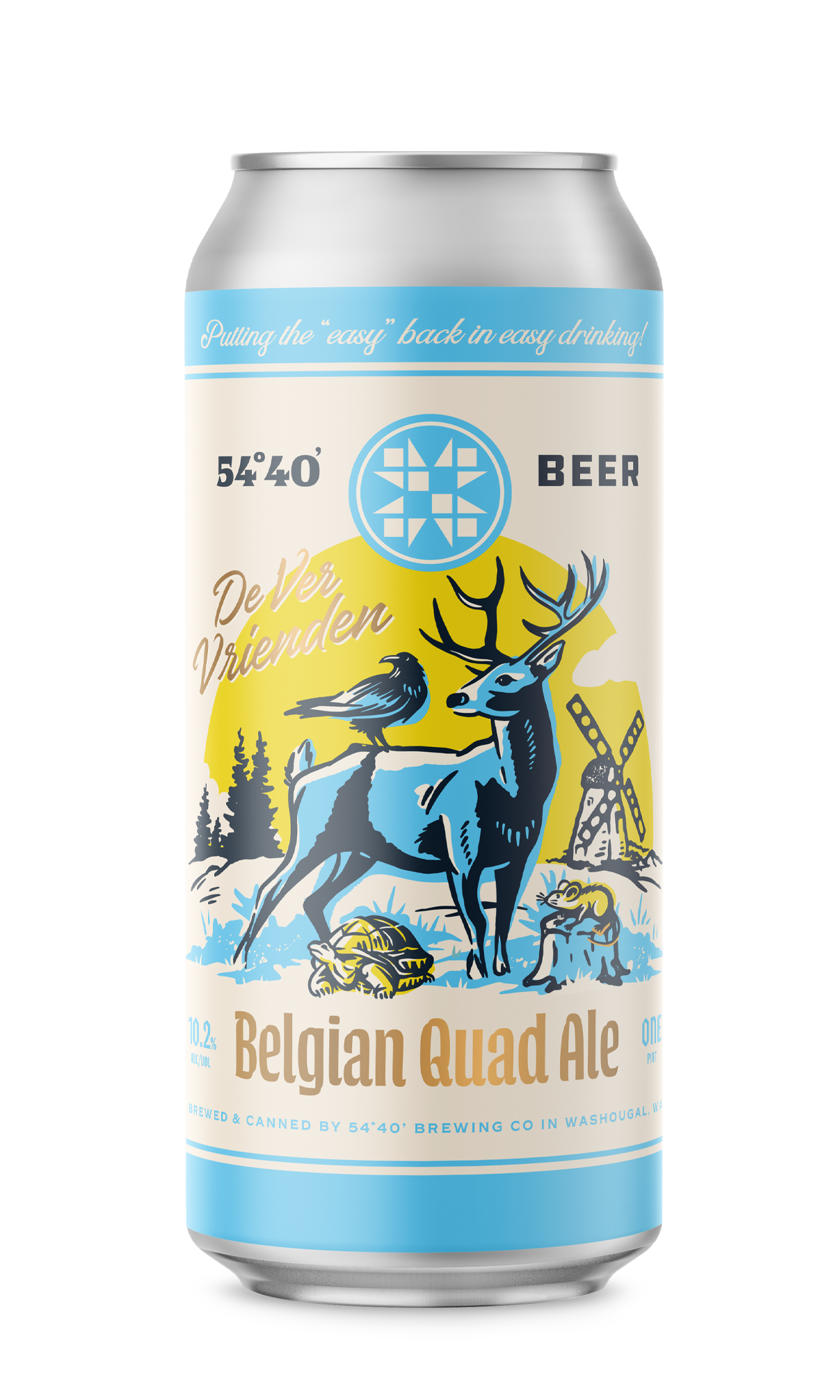
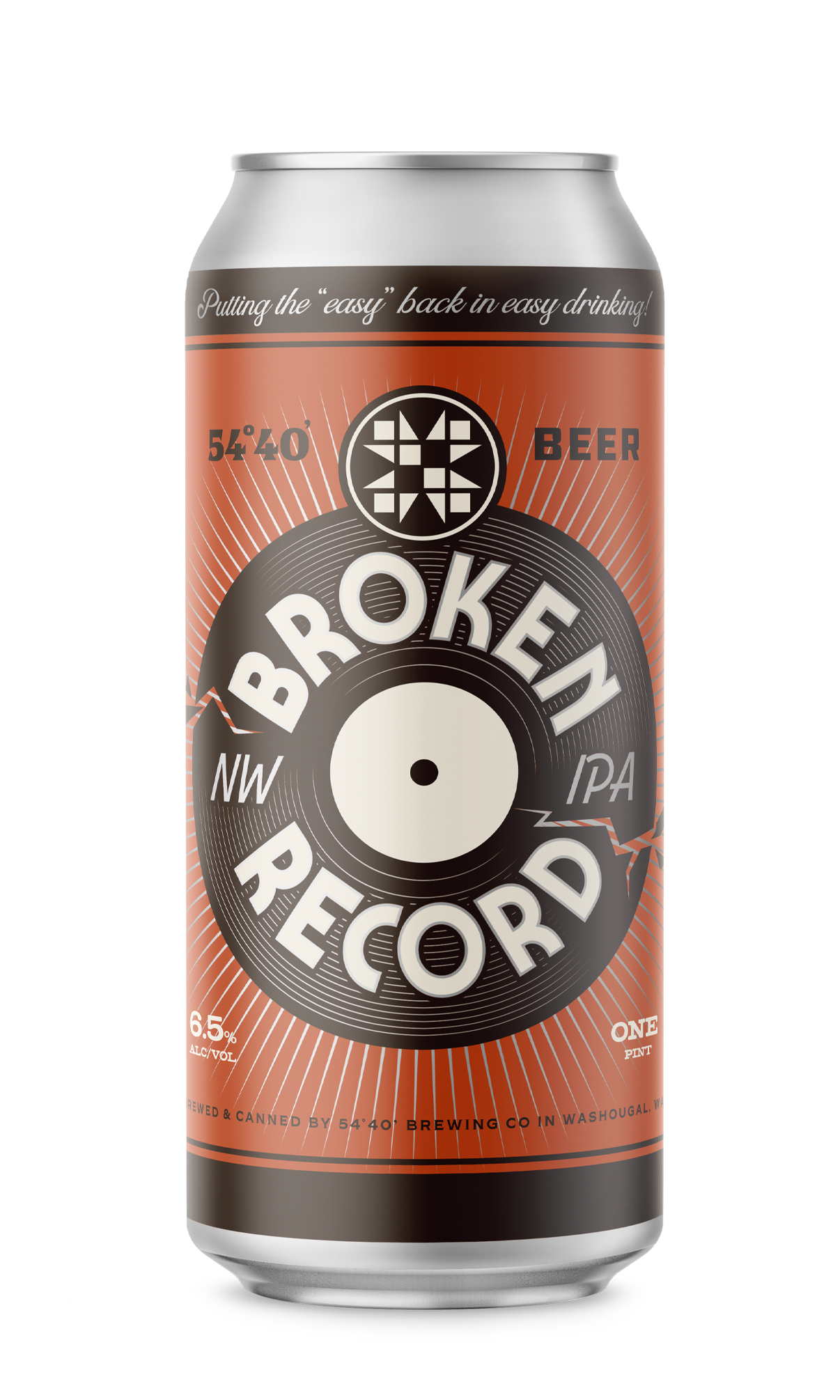
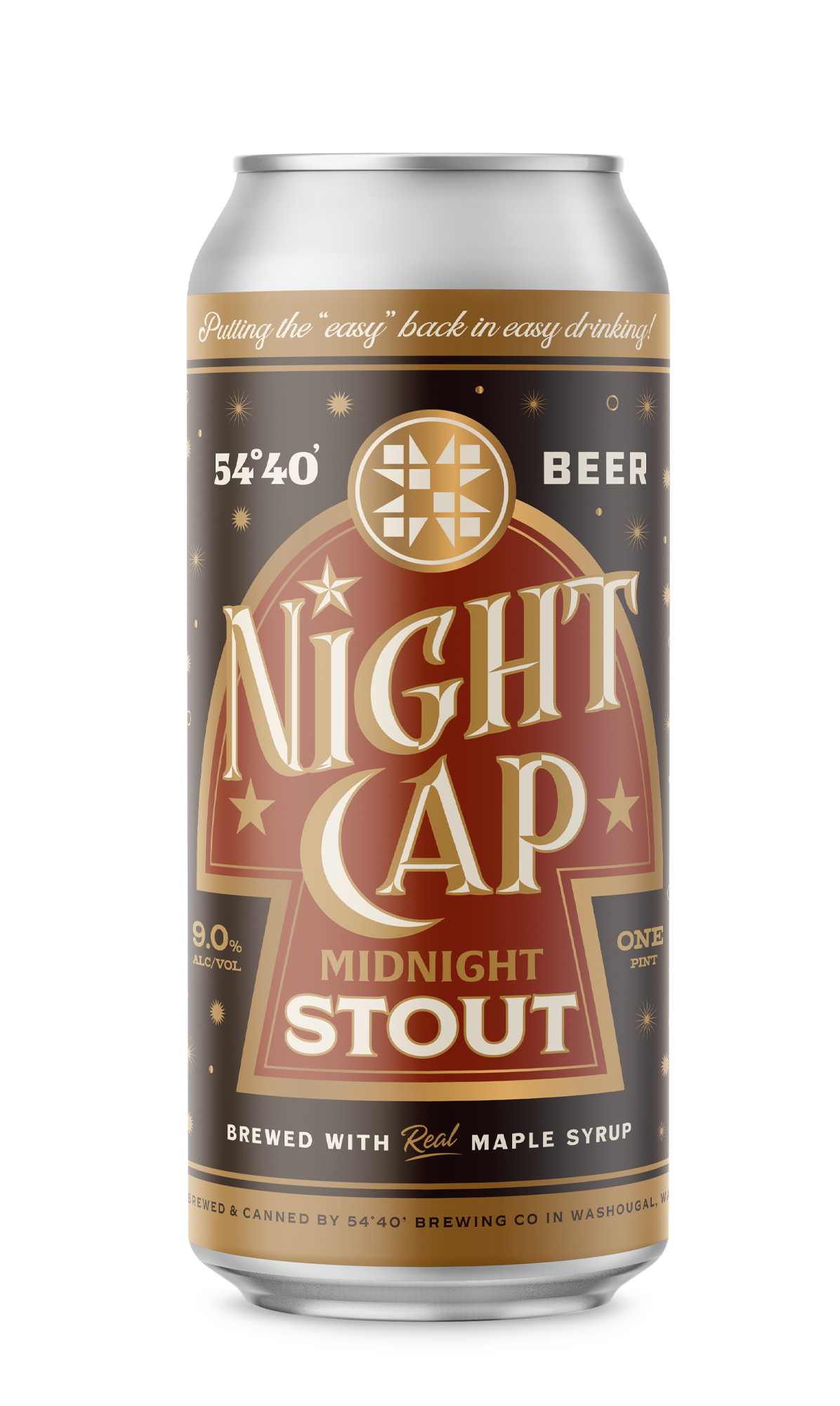
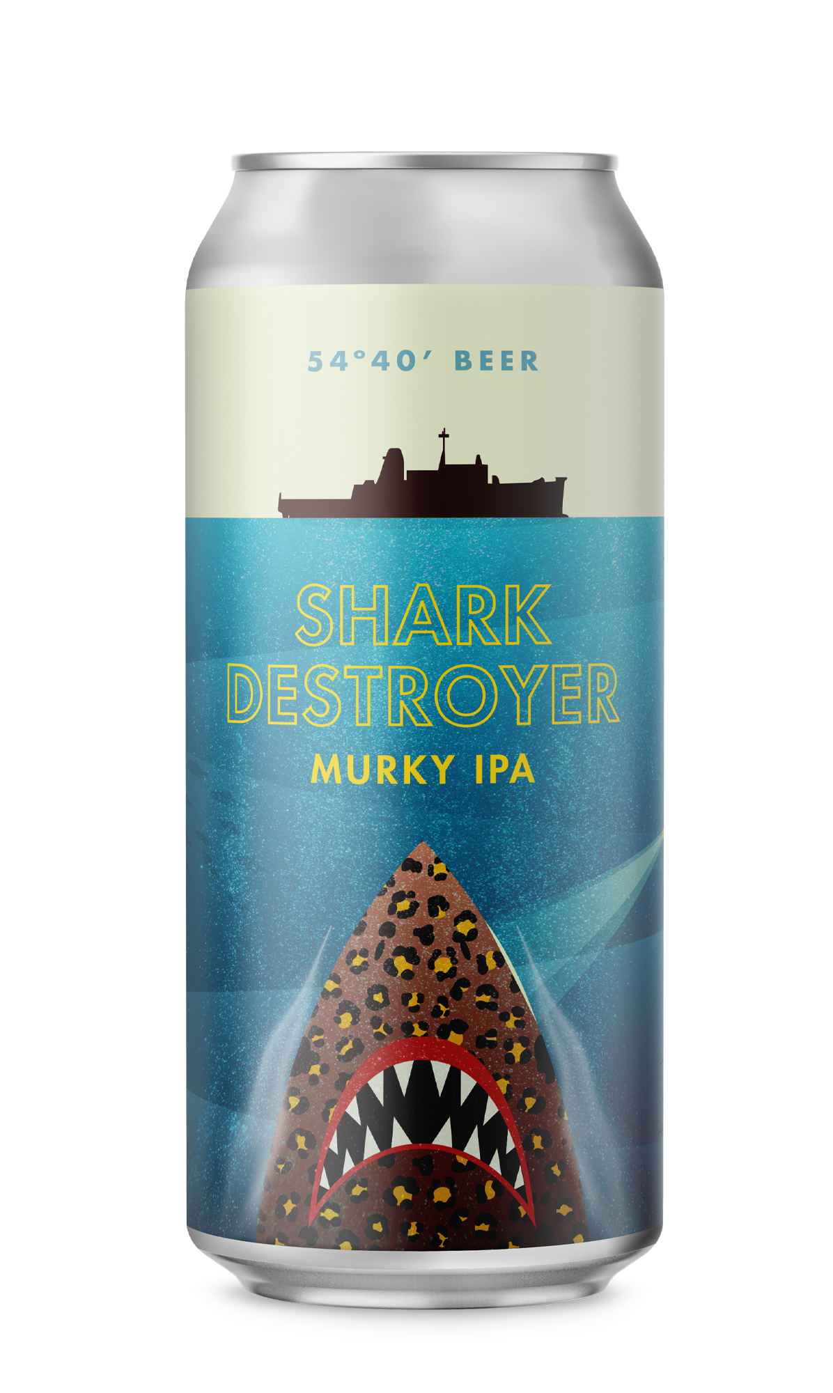
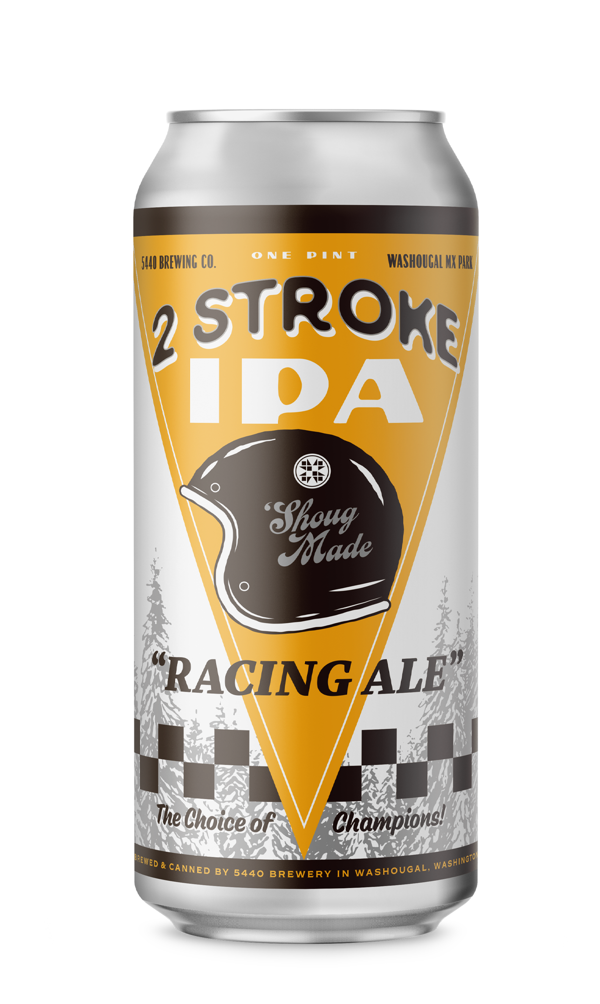
Packaging Design
Web Design
Merchandise
Brand Maintenance
The Problem?
Beer was becoming too serious.
In a beer market where the road to success is paved by repeated hype brews and candy-infused juice bombs, the idea to take a stand behind an easy-drinking light beer seemed crazy…


The Solution?
✹
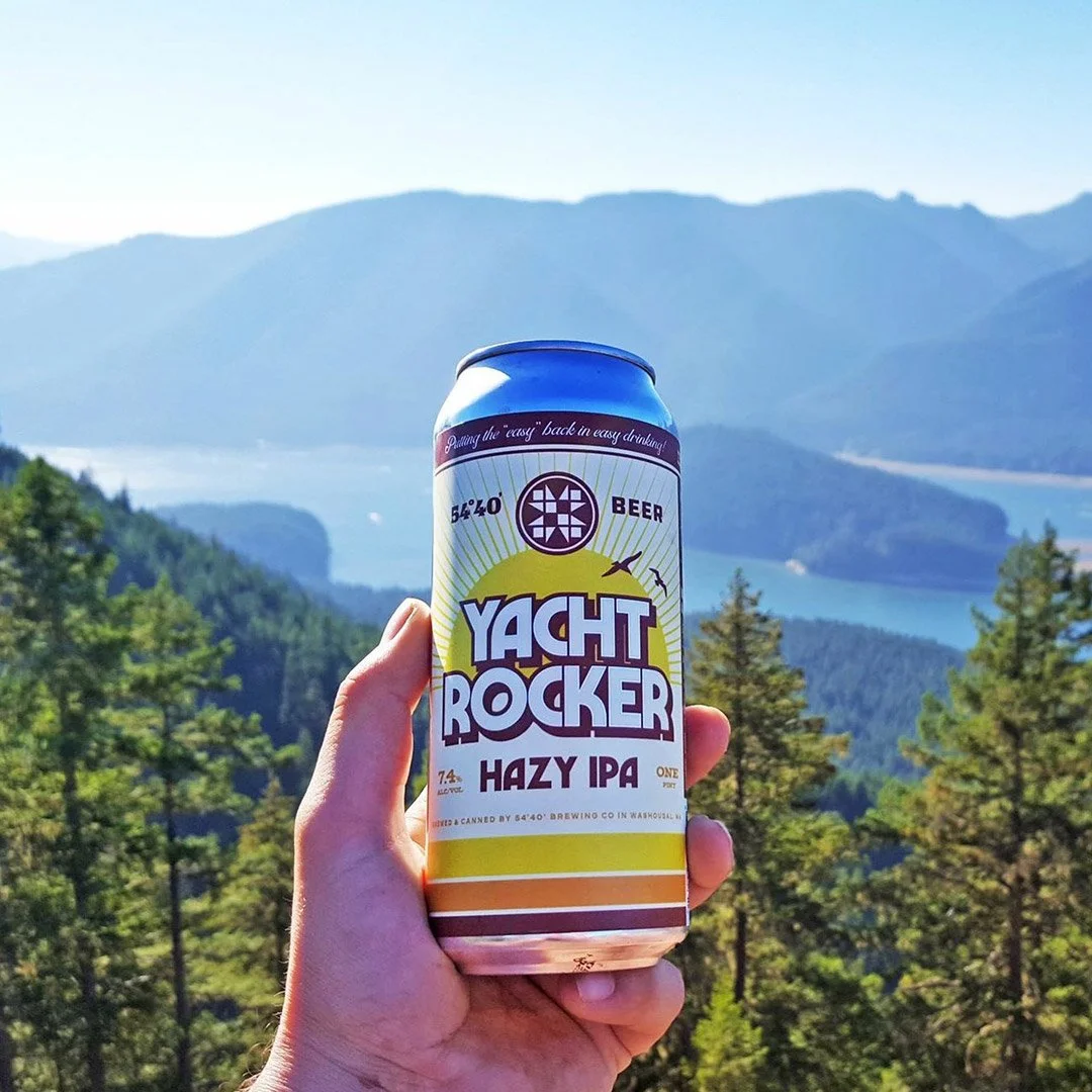
Putting the “Easy”
back in “Easy-Drinking”
It’s not about a “light lager” - It’s a mindset. The feeling of being surrounded by friends and family. It’s uncomplicated comfort. Accessible, low-pressure fun.

→ You can focus on the important things when you’re in a state of “Ease”.


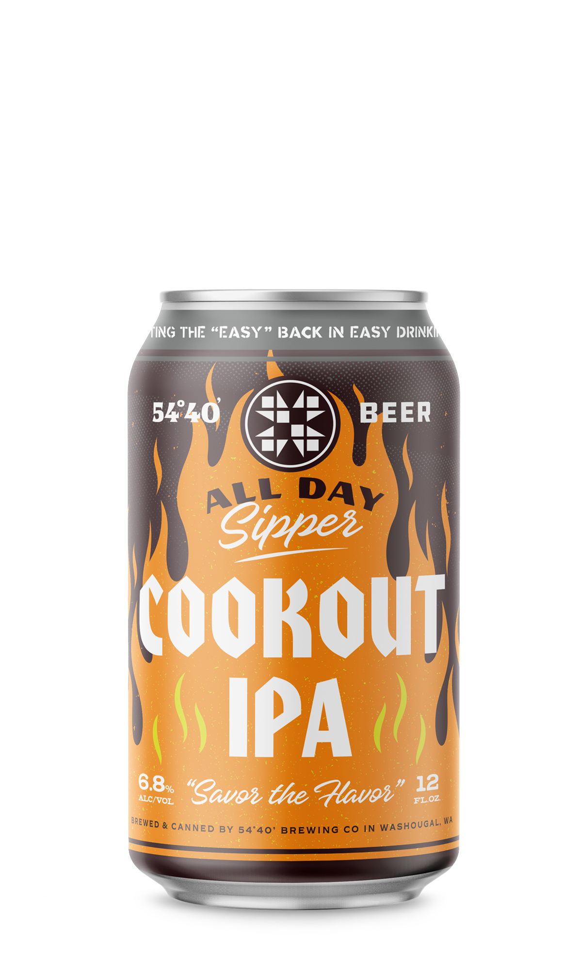
We began by tackling the primary mark.
The original design had a lack of balance and trouble at small scales. The solution was to reconstruct the mark within a grid - giving the stroke width uniformity, opening up the fill, and creating a stronger sense of spacial structure.
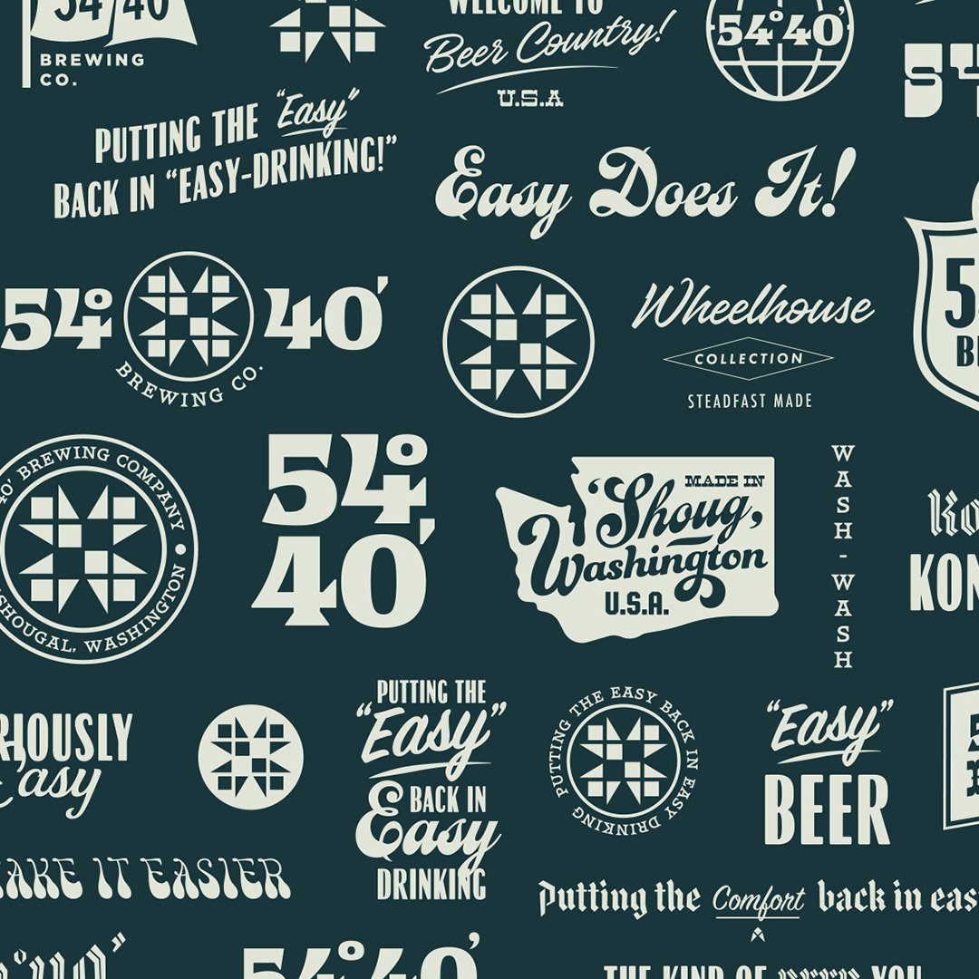
From there we tackled the additional marks in the Vis ID system…

Before
After
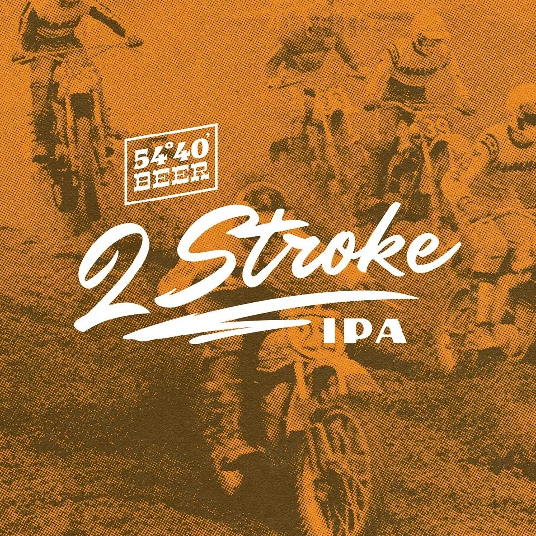
Additional Elements

Brand Slogan

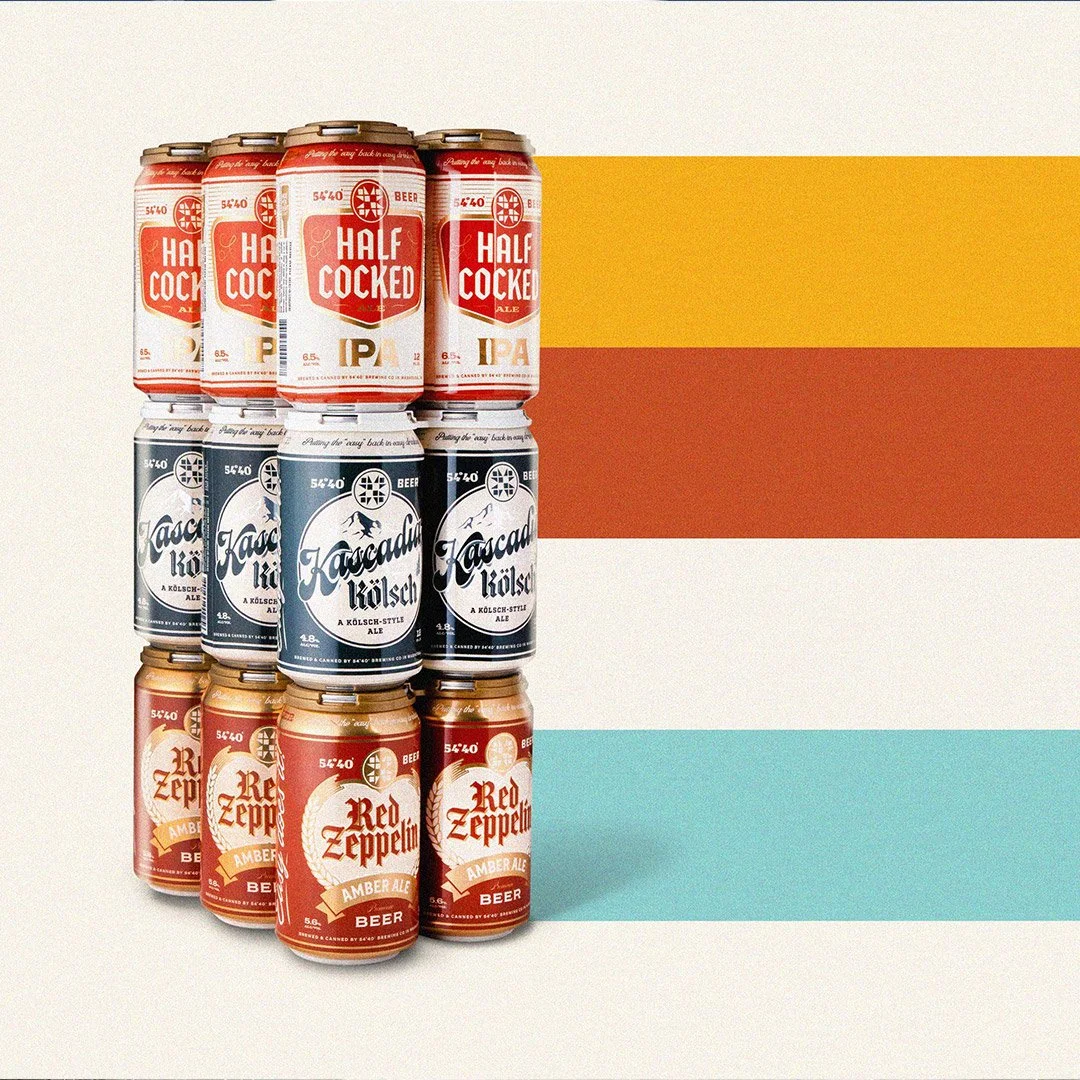
Brand Palette

Brand Pattern


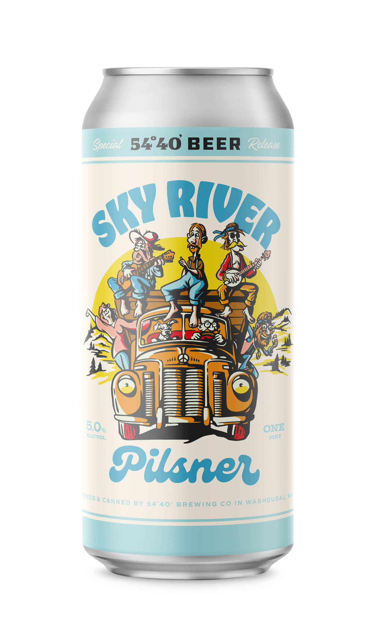
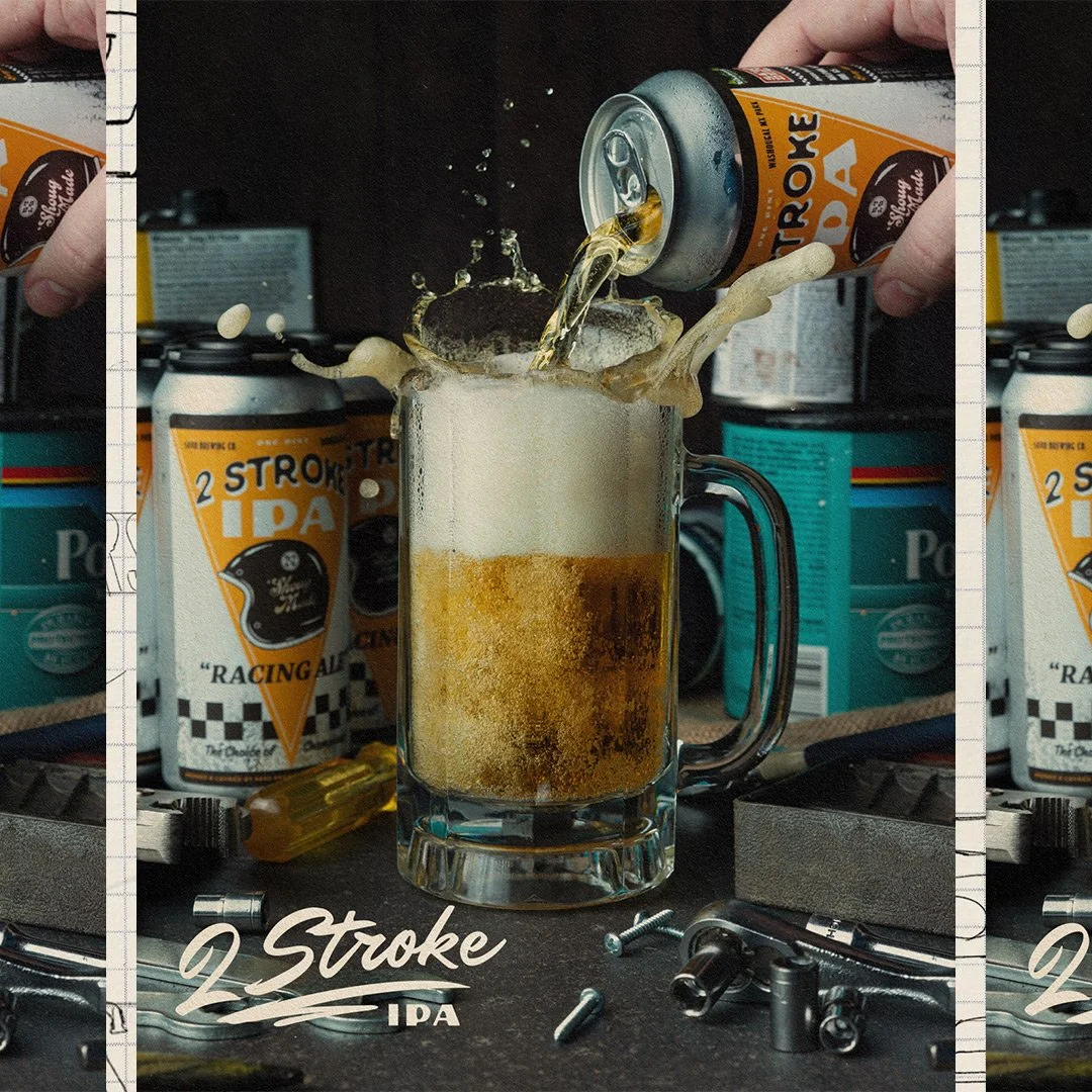
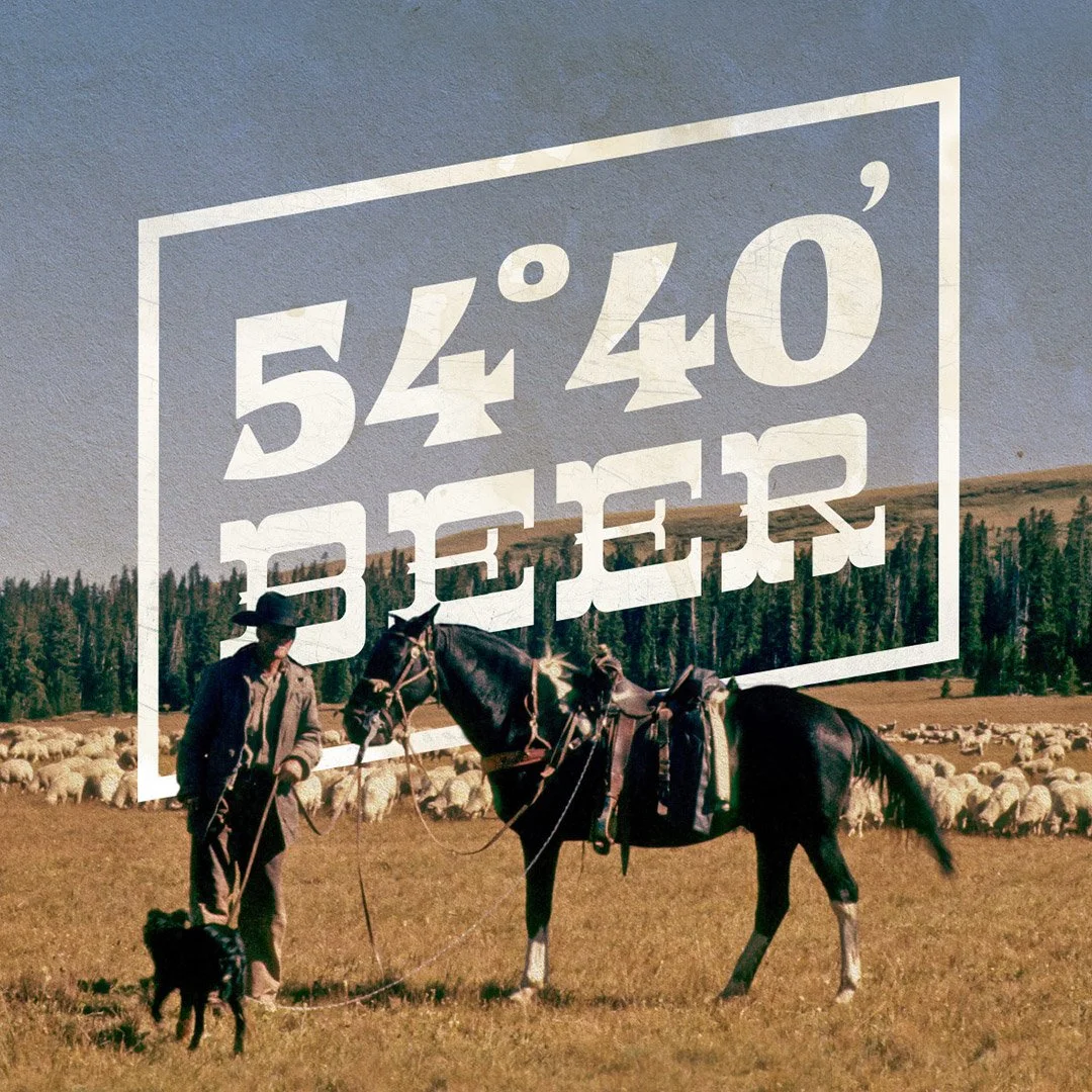
Finding inspiration in the past.
We looked to the golden days of Yesteryear to help visualize this re-establishment of beer’s role in the social system. Where the focus was on the communal activity and not the beer itself. A supporting act to the leading role that is human connection.