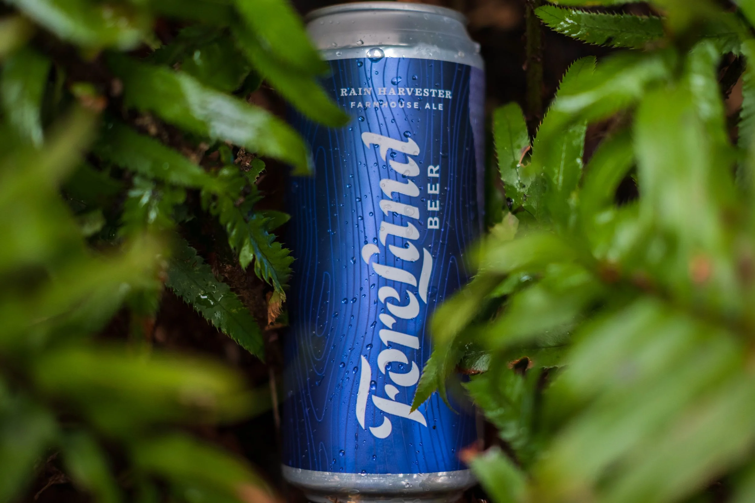
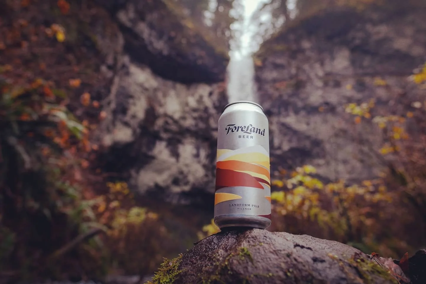
ForeLand Beer
WANDER THE IN-BETWEEN
ForeLand Beer is built behind the belief that prosperity lies in the in-between. Where the difference between good and great comes from nuanced discoveries found in the layered steps of the journey - not the destination.
We helped create an entirely new brand; developing everything from naming strategies to packaging, brand position, web design, and everything in between.
Scope
Naming
Visual Identity
Brand Strategy
Positioning
Packaging Design
Web Design
Merchandise
Brand Maintenance


We went through a number of concept explorations and iterations before landing on our custom-lettered wordmark. To accompany the type, we created a unique icon to introduce a simple graphical element to the ID system.

The Northwest
The foremost takeaway is a set of PNW trees side by side. This immediately puts the viewer in a specific place and promotes a Pacific Northwest feeling at first interaction.

Built by Layers
The concept of layers sit at the core of ForeLand’s visual identity and ownability. The “Treescape” icon also incorporates this fundamental idea with layered pieces fitting together in a way to help make out a bigger picture/landscape.

Two Founders
There are two founders of ForeLand, each represented by a singular tree - where, over time, they have interwoven their individualism to unite as one evolved concept and mark; ForeLand Beer.

Landscape Elements
The foremost takeaway is a set of PNW trees side by side. This immediately puts the viewer in a specific place and promotes a Pacific Northwest feeling at first interaction.