ACCESSIBLE BRILLIANCE
BLOCK 15 BREWING
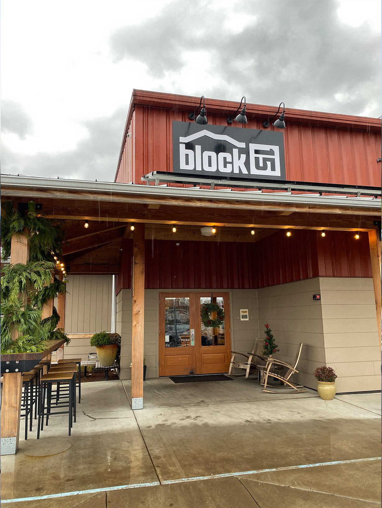
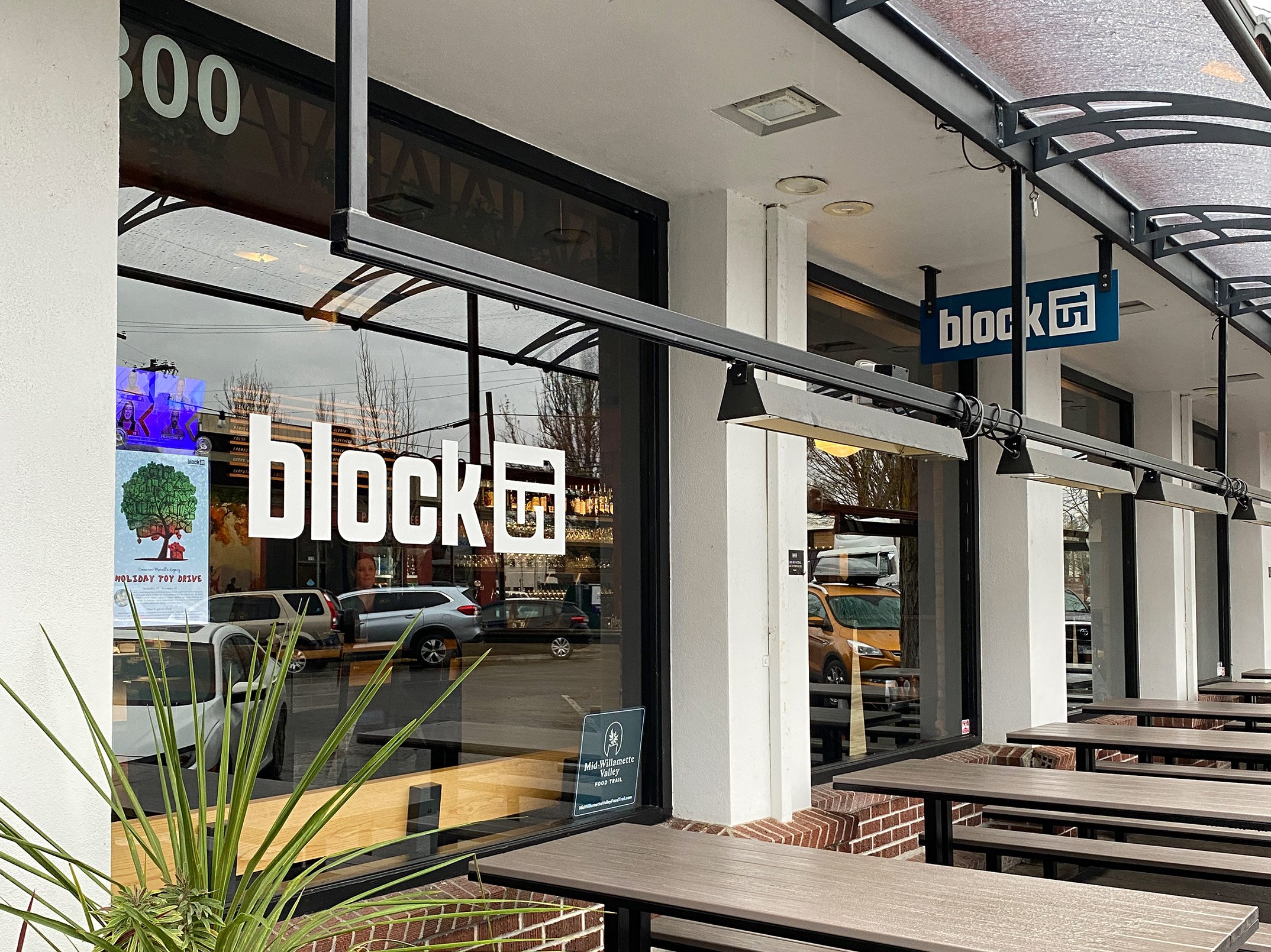
Block 15 is one of the largest breweries in the Northwest and based in Corvallis, Oregon. Opening in early 2008, they’ve managed to grow their legacy brewery opening multiple locations and launching a regional distribution company. After 15 years, they came to us looking for an update. We worked with them on a holistic rebrand, tackling everything from their overall value proposition, to a new visual identity, to their expansive packaging systems, and beyond.
SCOPE
Visual Identity
Brand Strategy
Voice & Messaging
Positioning
Packaging Design
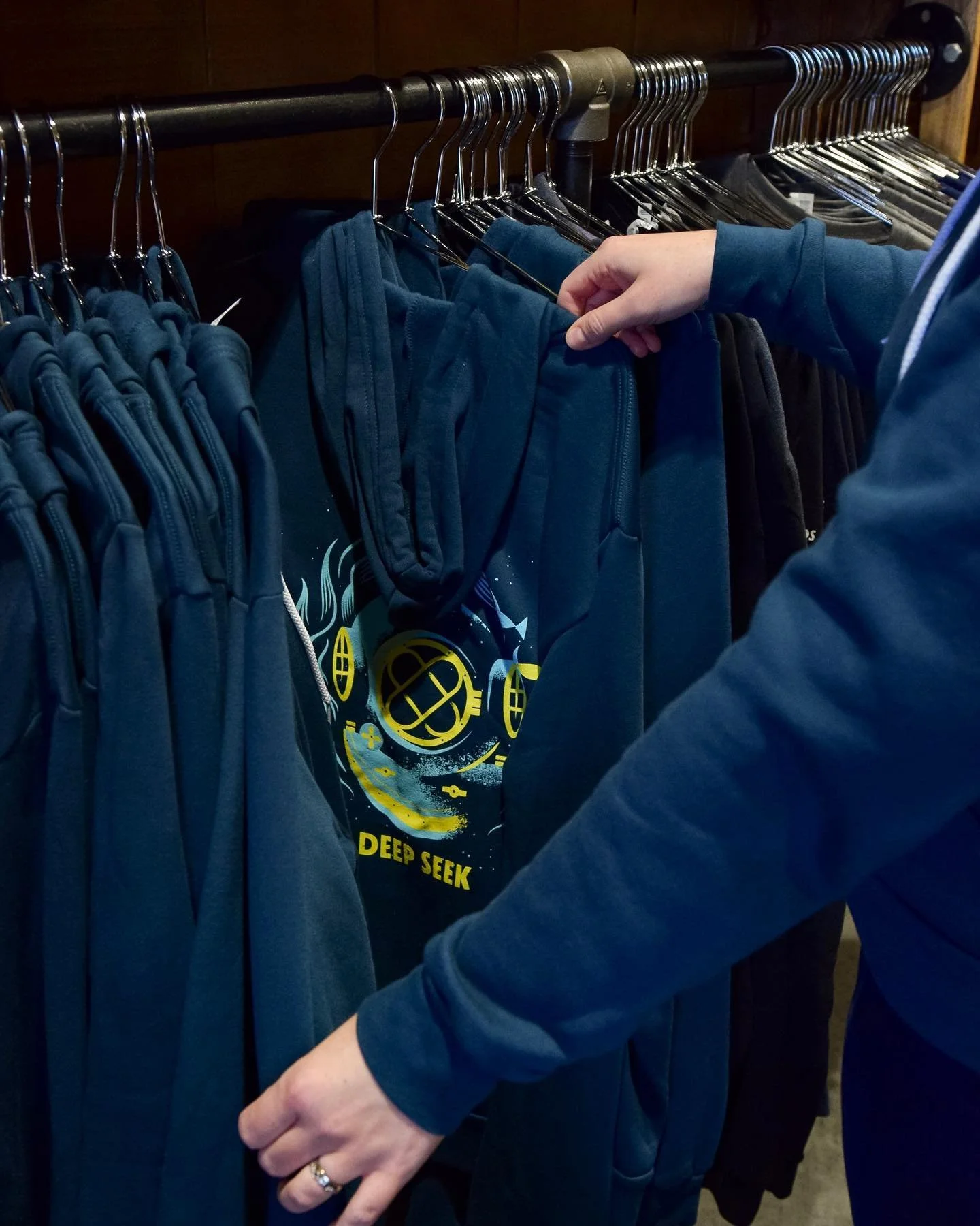
Merchandise
Brand Maintenance


Before
After
We started our journey by identifying the most equitable points of the original logo.
The original flipped 15 has been set on its side since day one, introduced back in 2008. It’s held steadfast as a major point of the brand’s recognition and we knew it was important to not only maintain its heritage-set presence, but to amplify it. We began our process with this mark as our anchor - the foundational piece to which we would then build the rest of the system around.
Primary
Seoncdary
Stacked
Icon
Blockburst


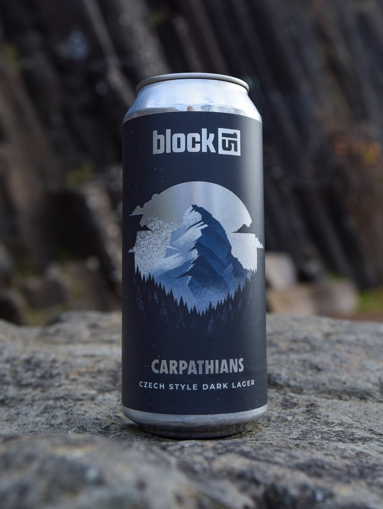
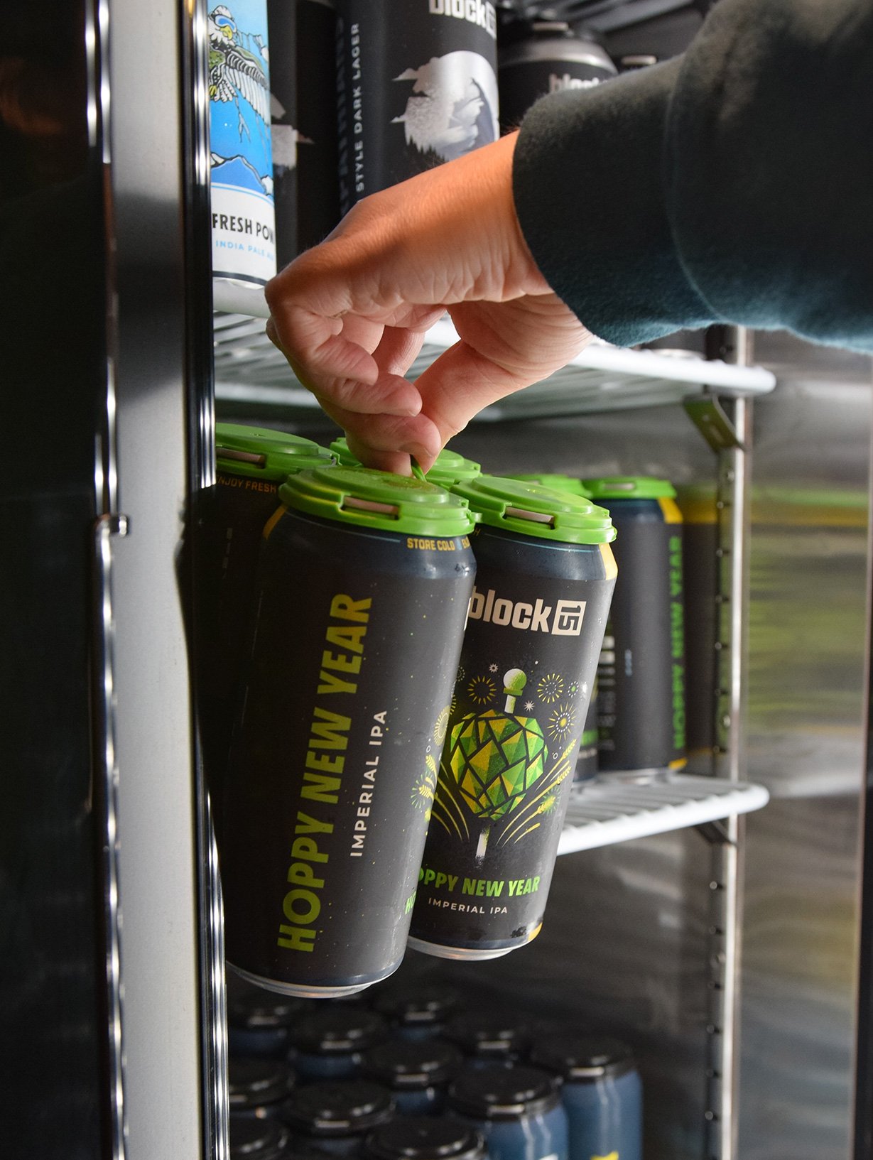
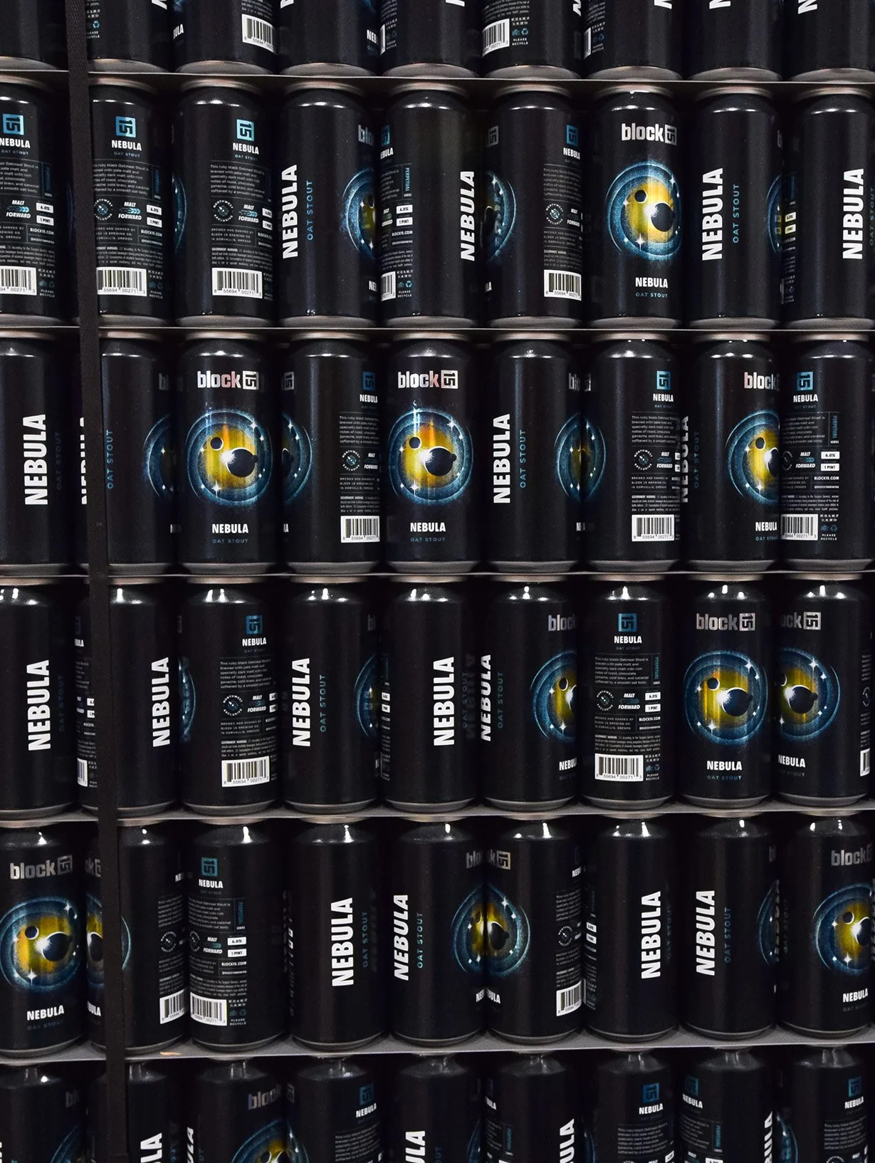
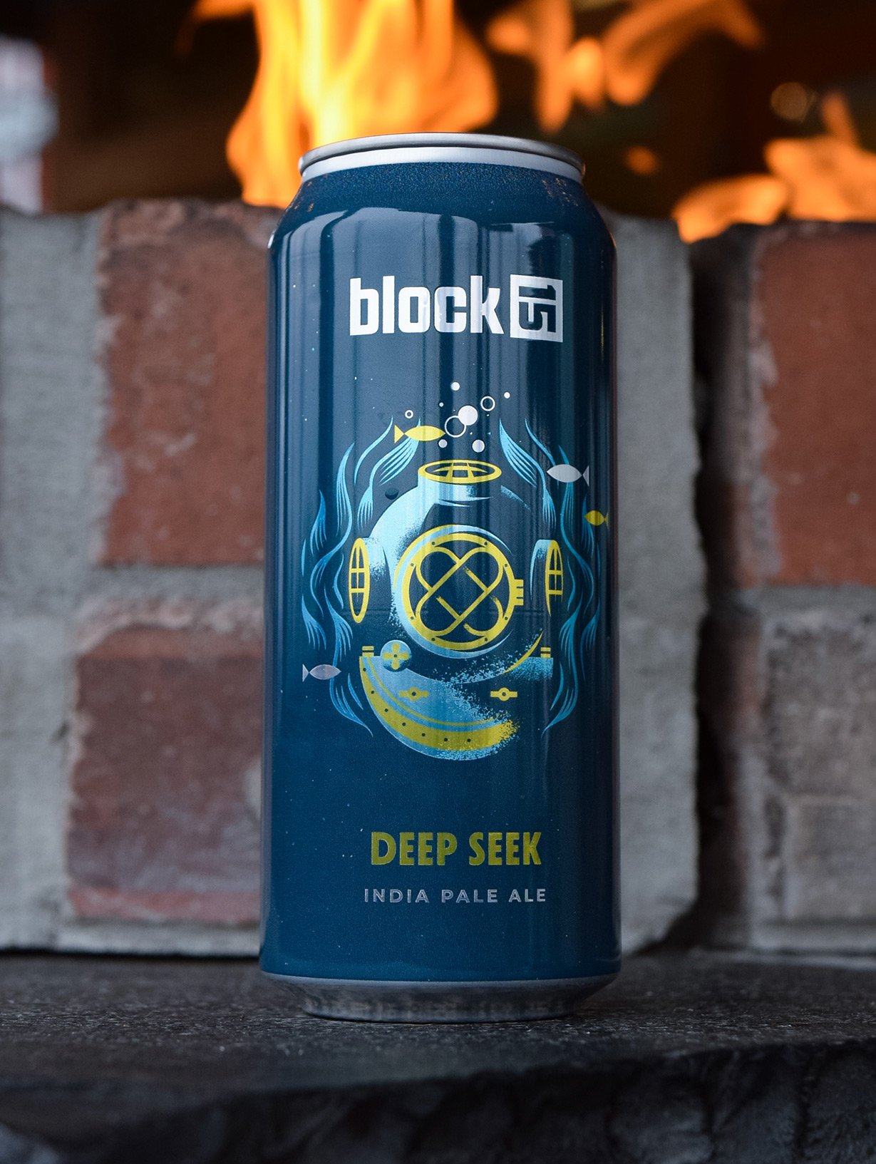
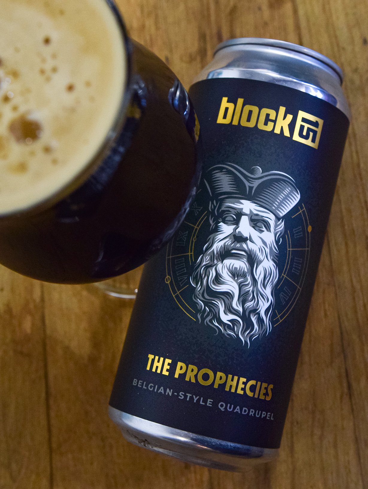
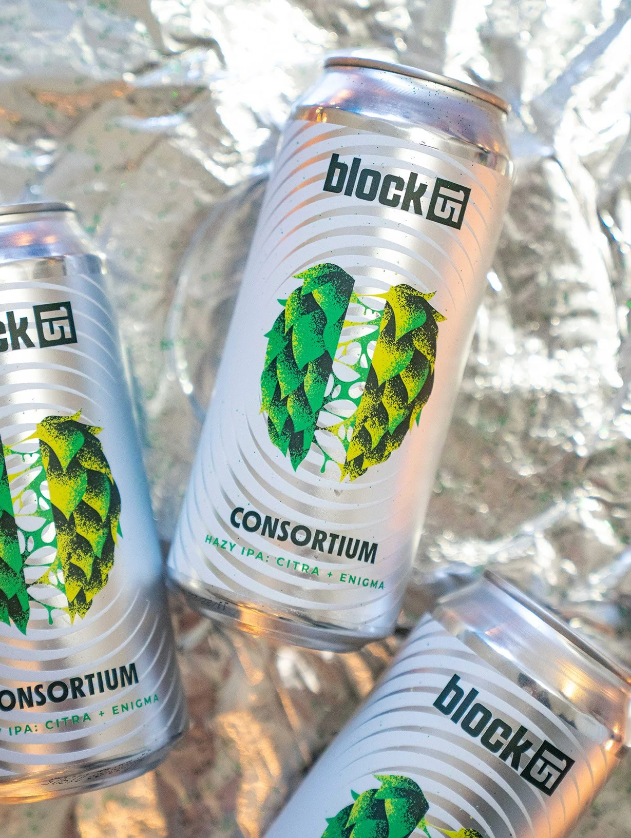
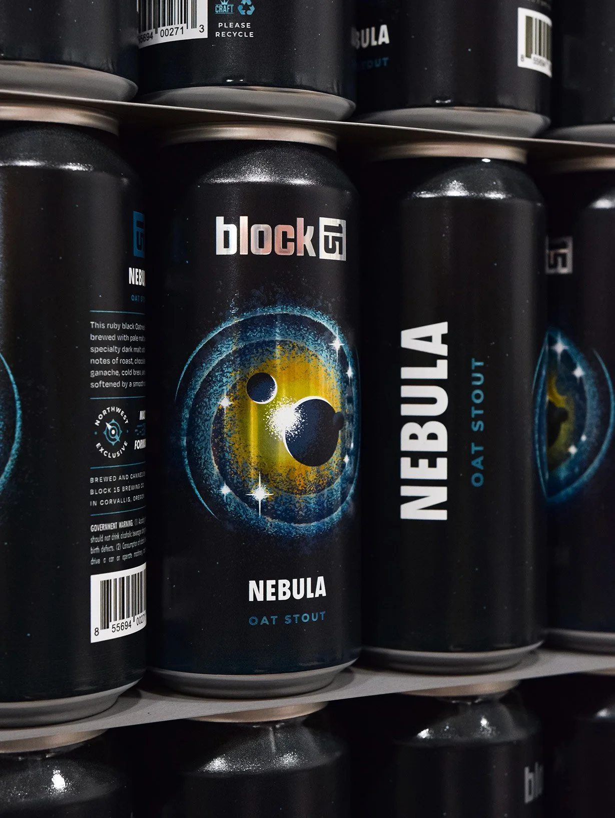
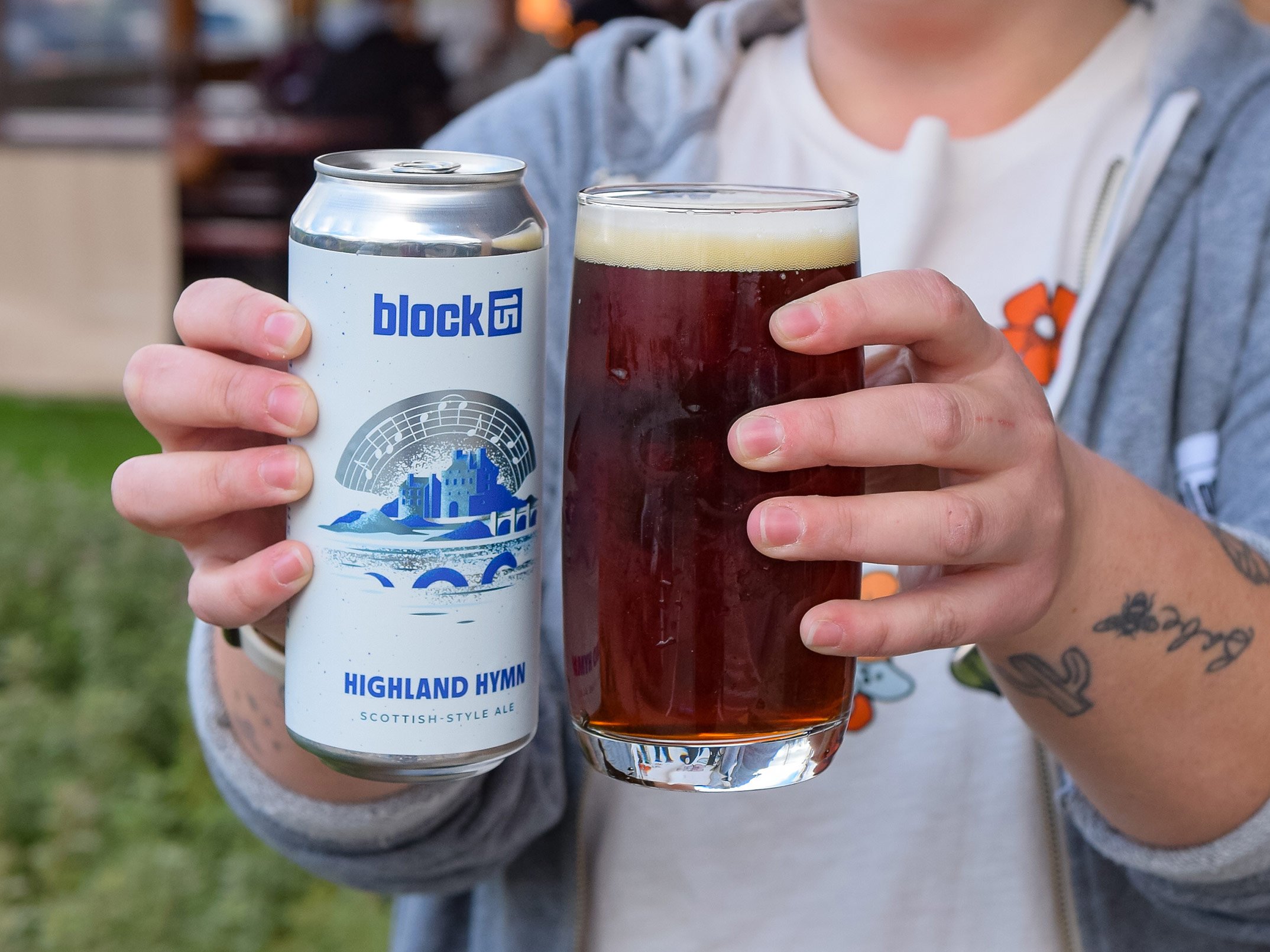
99 bottles of beer on the wall…
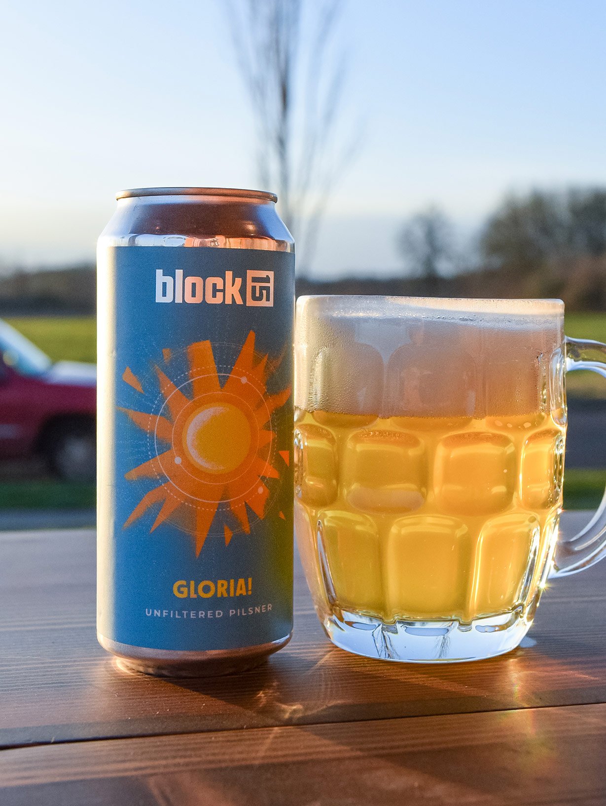
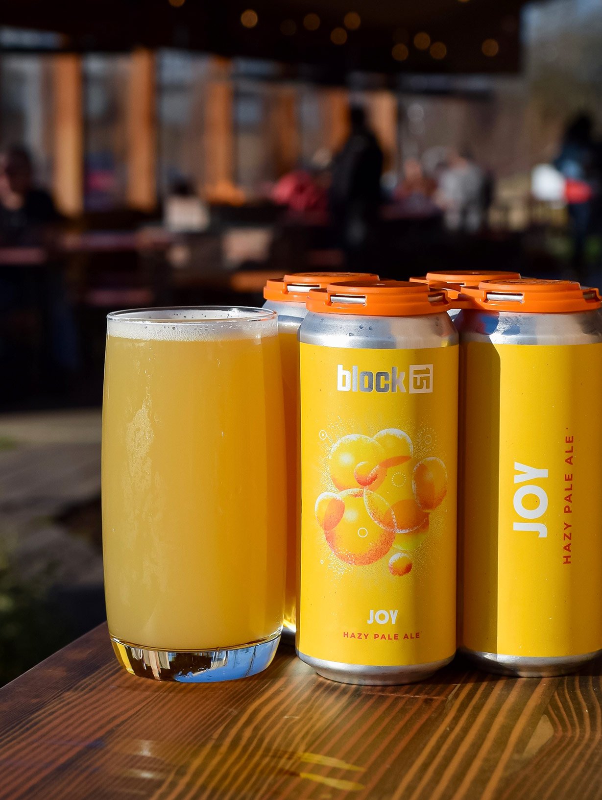
With nearly 100 unique SKUs released every year, Block 15 started to have a bit of an identity crisis on the shelf. We introduced a structured grid to the label template to help control the primary points of information and better unify to the overall system. And Because illustration work has been a pronounced part of the Block 15 ethos, we dedicated a centralized point to ensure it remained in the heriarchy.


Before

After